A custom typeface, a sharpened Werder Green, and the diamond as the blueprint. The new design system translates 127 years of SV Werder Bremen’s history into the present.
SV WERDER BREMEN
The iconic diamond remains untouched. Rather than being redesigned, its clarity, geometry, and timeless character became the foundation for the entire visual system.At its centre is “Bruckmeyer Neue,” a custom typeface developed exclusively for the club. It is named after Günther Bruckmeyer, the graphic artist who designed Werder’s first “W” in 1924, the visual origin of today’s diamond. Inspired by the geometry of this historic symbol, the typeface carries the club’s heritage into a contemporary and distinctive visual language. Werder Green was refined into a richer, calmer, and more distinctly Hanseatic tone. The wider colour palette was expanded and systematised with shades rooted in Bremen and the river Weser, each created to serve a clear purpose within the identity.Together, the typography, colours, and graphic principles form a coherent and flexible system across every touchpoint, from the Weserstadion and digital platforms to merchandise and the team’s shirts. The result is not a new beginning, but a consistent evolution of what has always defined Werder Bremen: a visual identity rooted in history and designed for what comes next.
Lebenslang Grün-Weiß. Gestern, heute, morgen, immer.
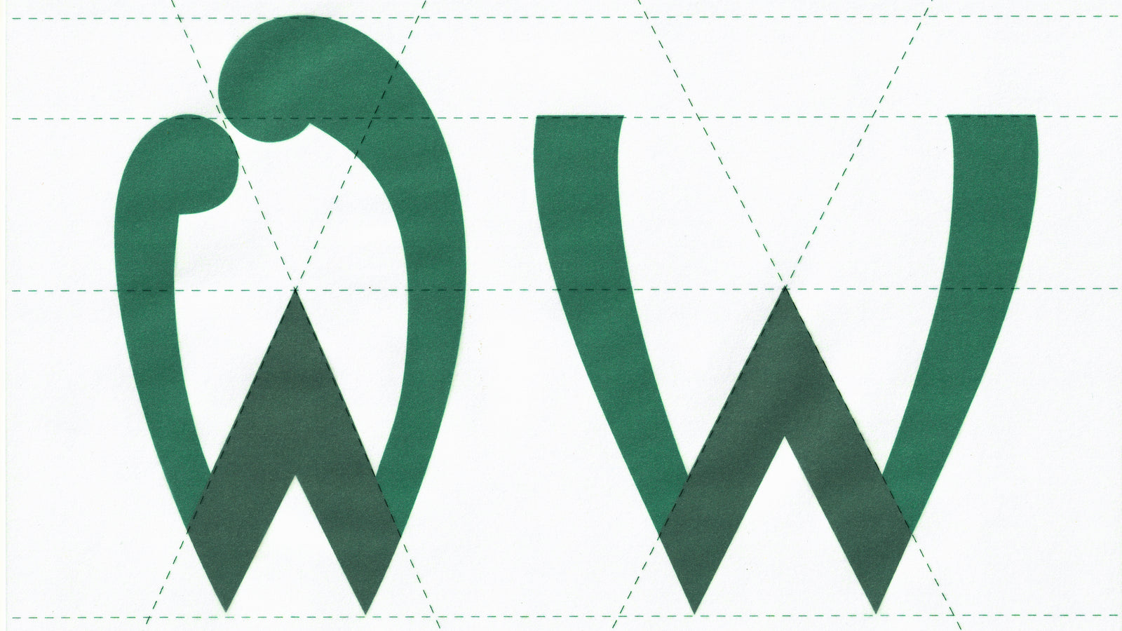


A typeface for Werder alone
The new house typeface, Bruckmeyer Neue, was developed exclusively for the club. It is named after Günther Bruckmeyer, the commercial artist who designed the first Werder W in 1924 – the design origin of today’s diamond. A century later, the typeface carries his name and his hand: a serif face whose forms are inspired by the geometry of the Werder W. Clear, full of character, unmistakable. In future it will be used everywhere, from the lettering on the shirt to the scoreboard at the Weserstadion.


“Werder is developing continuously. With the Campus, Platz 11, new digital platforms and further projects, a whole range of new touchpoints with our club is emerging. That is precisely why now was the right moment to give our brand a foundation that connects this development.”
Klaus Filbry, Chairman of the Management Board, SV Werder Bremen


“Tradition is not a look back, it is a driving force. We were not searching for something new – we were searching for what has always defined Werder.”
Christian Stoll, Head of Brand & Marketing, SV Werder Bremen GmbH & Co. KG aA


