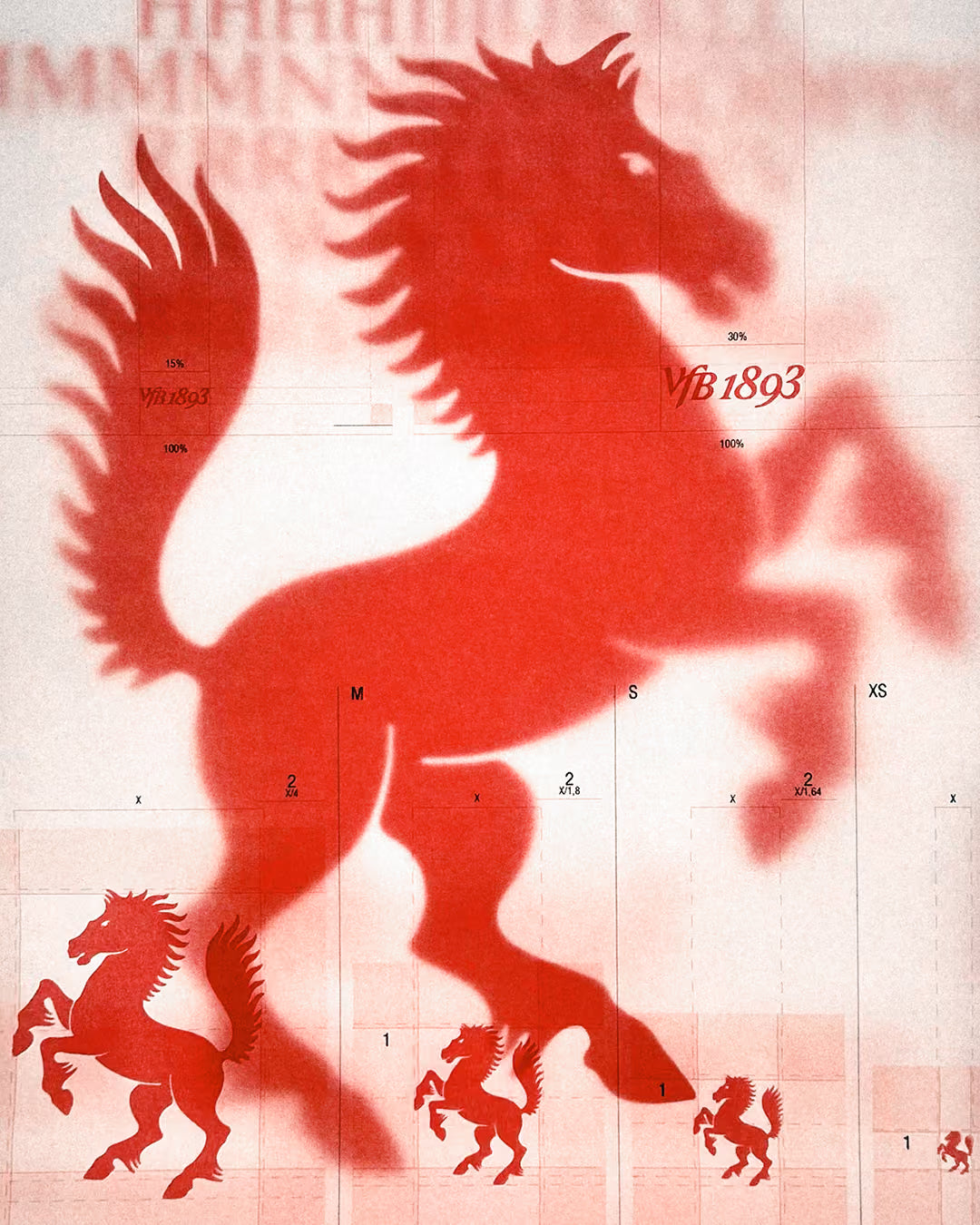
We had the honor to work with VfB Stuttgart 1893 on updating the club’s brand identity.
VFB STUTTGART
At the heart of the project was the ambition to reconnect the club’s DNA – Verein für Bewegungsspiele – with a contemporary visual system that reflects both tradition and progress. Together with VfB, we worked on the brand strategy, design principles, and a refreshed visual language that gives movement a clear direction, while leaving core elements like the crest, club colors, and red hoop untouched.
The new identity introduces a custom typeface (“TWK Concordia”) designed in collaboration with Nolan Paparelli & Nina Faulhaber, a new wordmark “VfB 1893,” and a refined use of the horse, Stuttgart’s heraldic symbol. These elements are rooted in the club’s history and values while creating a system that strengthens clarity, cultural relevance, and adaptability across platforms — from the stadium to the city and beyond.


